The Indian Pantry
Tradition with a twist
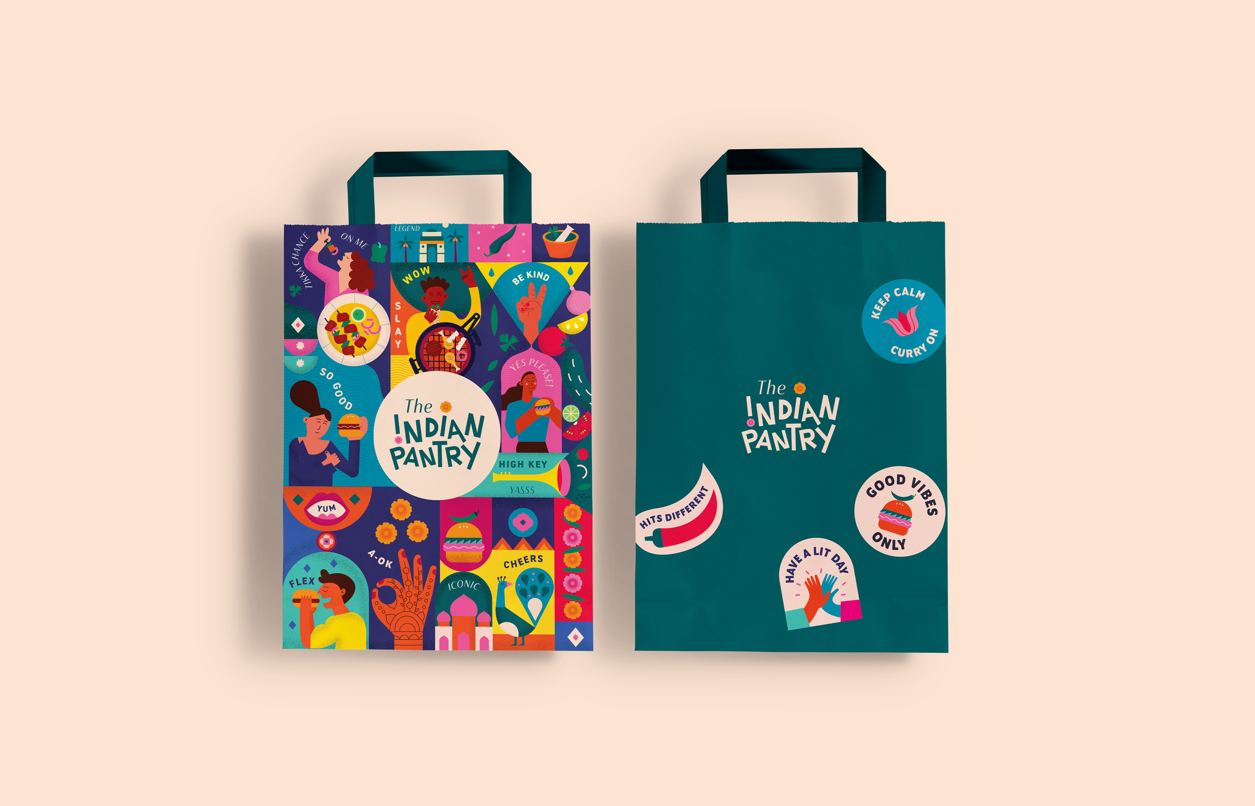
Branding and packaging design for @theindianpantry_uk in London, an exciting and casual all-day eatery that celebrates the rich culinary heritage of India. Our goal was to create a visually captivating brand identity that showcases the fusion of diverse cultures and promotes a unique street food experience with an innovative twist.
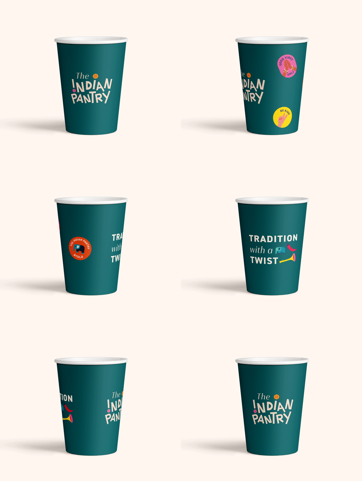
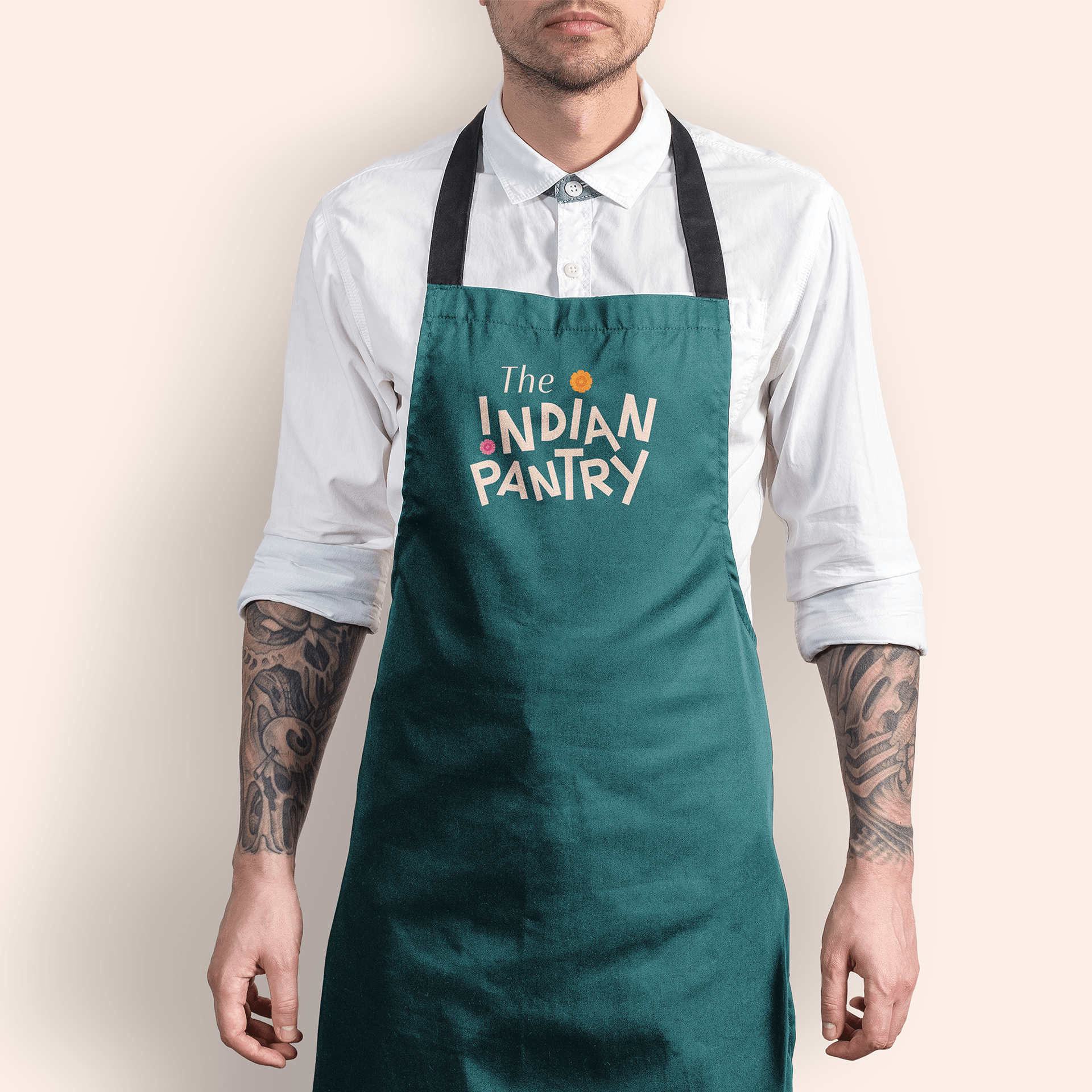
Drawing inspiration from its essence, we have developed a bold, playful, and vibrant branding concept that reflects the fun and casual spirit of The Indian Pantry. Our custom-designed logo features a custom typeface that exudes the brand's zest for life and sense of enjoyment. Additionally, we have incorporated the marigold flower, a symbol deeply rooted in Indian culture, to evoke a sense of familiarity.
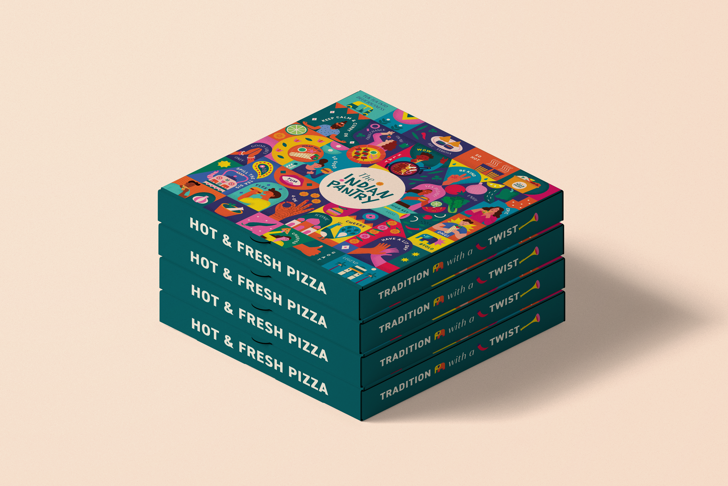
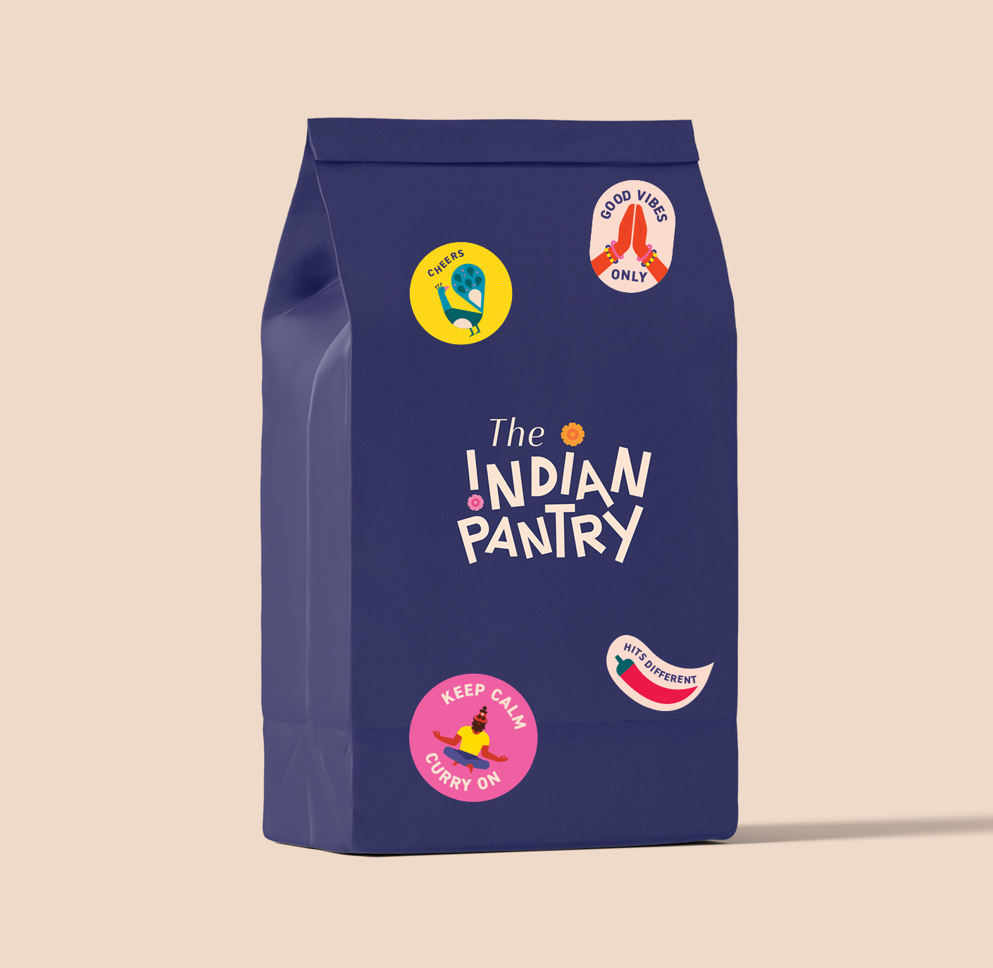
Our brand's central illustration showcases people relishing street food while seamlessly merging traditional cultural motifs with modern design elements. This represents a blend of tradition and modernity, resulting in a distinctive and unforgettable brand identity. To further enhance relatability, we have integrated playful food-related words into the design. The color palette we have chosen symbolizes the energy, excitement, and vibrancy of Indian street food and culture.
In our creative process, we were determined to avoid creating something generic and outdated that had already been done before, as we recognized the importance of standing out, breaking from stereotypes, and avoiding a mundane design. Our goal was to create something that breaks away from the norm and captivates attention with its fresh and engaging appeal.


